How to handle Data, and Images(18) Matplotlib Intro
Introduction to Matplotlib and how to plot a line graph and save the figure
Lesson Notes in .ipynb file
How to handle Data, and Images(18) - Matplotlib Intro
Topics
- Matplotlib Basics
- Drawing simple line graph
- Saving Graph (1)
- Saving Graph (2)
- Drawing Line Graph (1)
- Drawing Line Graph (2)
- Summary
Matplotlib Basics
- Matplotlib is an opensource library that allows to visualize data
- From simple data analyzation, AI model visualization there’s a lot of usage
Drawing simple line graph
- matplotlib.pyplot.plot(): Plot y versus x as lines and/or markers.
1
2
3
4
5
6
7
8
9
10
11
12
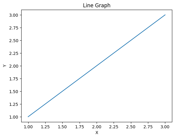
import matplotlib.pyplot as plt
x = [1,2,3]
y = [1,2,3]
# plot the graph
plt.plot(x, y)
# title it 'Line Graph' with label 'X', and 'Y'
plt.title('Line Graph')
plt.xlabel('X')
plt.ylabel('Y')
plt.show()
Output:
| Basic Line Graph |
 |
Saving Graph (1)
- matploblib.pyplot.savefig(): Save the current figure as an image or vector graphic to a file.
1
2
3
4
5
6
7
8
9
10
11
12
13
import matplotlib.pyplot as plt

x = [1,2,3]
y = [1,2,3]
# plot the graph
plt.plot(x, y)

# title it 'Line Graph' with label 'X', and 'Y'
plt.title('Line Graph')
plt.xlabel('X')
plt.ylabel('Y')
# save the figure as 'line_graph.png'
plt.savefig('line_graph.png')
Output:
| Basic Line Graph | Saved Fig |
|  |
Saving Graph(2)
1
2
3
4
5
6
7
8
9
10
11
12
13
14
import matplotlib.pyplot as plt
import numpy as np

# with width pi * 10, make 500 dots equally
x = np.linspace(0, np.pi * 10, 500)
# make 2 graphs
fig, axes = plt.subplots(2, 1)
# 1st graph is sin graph
axes[0].plot(x, np.sin(x))
# 2nd graph is cos graph
axes[1].plot(x, np.cos(x))

# save figure as 'sin&cos.png'
fig.savefig('sin&cos.png')
Output:
| Sin & Cos Graph | Saved Figure |
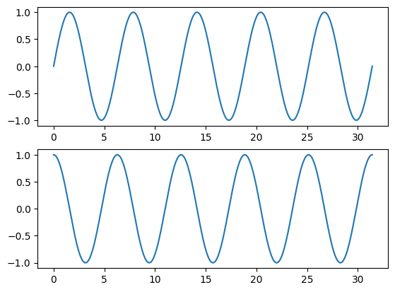 |  |
Drawing Line Graph (1)
1
2
3
4
5
6
7
8
9
import matplotlib.pyplot as plt
import numpy as np

x = np.arange(-9, 10)
y = x ** 2
# as a linestyle we can use '-', ':', '-.' '--' and more
plt.plot(x, y, linestyle=':', marker='*')

plt.show()
Output:
| $y = x^2$ |
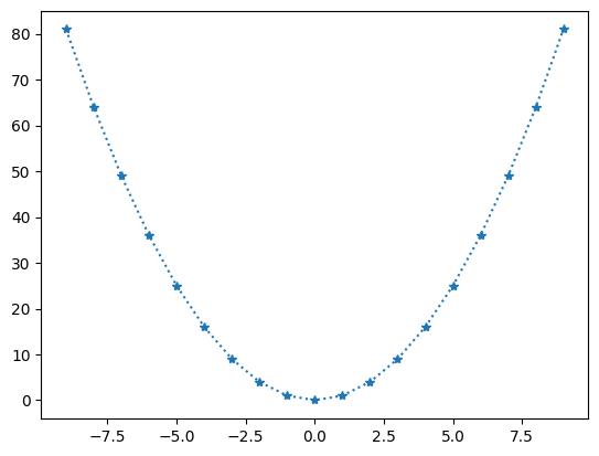 |
Drawing Line Graph (2)
1
2
3
4
5
6
7
8
9
10
11
12
13
14
15
16
17
18
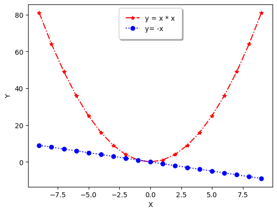
import matplotlib.pyplot as plt
import numpy as np
x = np.arange(-9, 10)
y1 = x ** 2
y2 = -x
# plot a line graph 'y = x ** 2'
plt.plot(x, y1, linestyle='-.', marker='*', color='red', label='y = x * x')
# plot a line graph 'y = -x'
plt.plot(x, y2, linestyle=':', marker='o', color='blue', label='y= -x')
plt.xlabel('X')
plt.ylabel('Y')
plt.legend(
shadow = True,
borderpad = 1
)
plt.show()
Output:
| Figure |
 |
Summary
- matplotlib.pyplot.plot(): Plot y versus x as lines and/or markers.
- matploblib.pyplot.savefig(): Save the current figure as an image or vector graphic to a file.
This post is licensed under CC BY 4.0 by the author.